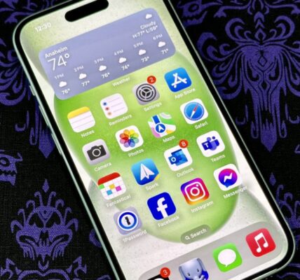
When Apple launched the iPhone 16 line, it also released iOS 18 to the masses after months of betas. Though the biggest feature of iOS 18 is Apple Intelligence, which didn’t actually launch until the iOS 18.1 release, there are plenty of other things that iOS 18 brings to the table. That includes RCS messaging, more home screen customization, a revamped Control Center, and more.
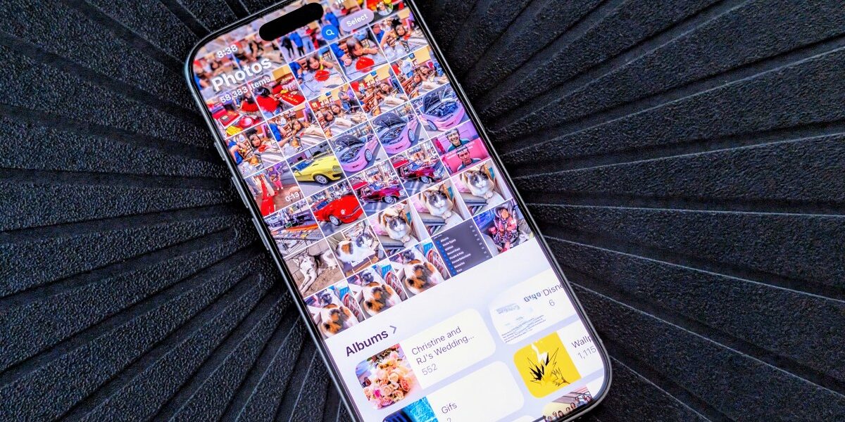
One app that got a significant redesign in iOS 18 is the Photos app. After around a decade of mostly the same design and what I would call muscle memory, the new Photos app is, well, quite jarring — and I’m not a fan.
The new Photos app is messy
For years, the Photos app was neatly organized, and the tabbed sections made it easy to find what you needed. The main tab was the Camera Roll, and then you could go to another section to view by year/month/day. There was also a section just for searching.
Then there was the For You page, which was the least used screen — at least for me. This was where you had Apple Photos’ curated collection of photos, memories, images, and videos shared with you, as well as other things that the app thought you would like.
I’ll be honest with you —I barely used that section. Unless I was feeling nostalgic, I mainly used the Photos app to view my recent photos, videos, and albums, search, and make screenshots for work. And it worked well!

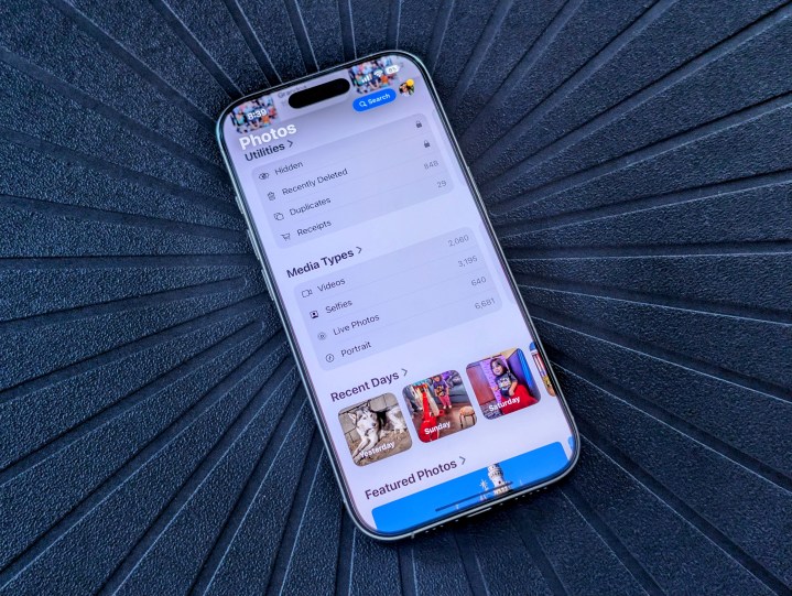
However, iOS 18’s redesigned Photos app shoves the For You stuff down your throat by default. The tabbed sections to separate everything are gone, and now everything is fighting for your attention when you open up Photos. Scroll up to view your Photo Library, and scroll down to see everything else.
Apple seems focused on pushing the memories bit a little too much, as the default order has Recent Days, Memories, and Trips in the top five sections. I’m sure that for some people, reminiscing down memory lane is nice, but for me, I need quick access to certain photos and albums I have (i.e., my Disneyland Magic Key pass).
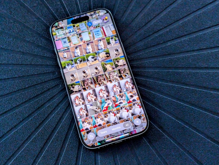
Unfortunately, Apple seems to think that people don’t use the albums because they’re at the bottom of the default order. In the first few days of having iOS 18 installed, it was very irritating when I couldn’t quickly find my Disney album to pull up my Magic Key pass to scan in for parking and to the park.
A few days later, I discovered that, yes, you can customize your Photos app section order to whatever you’d like and even hide certain things you don’t want at all. But Apple didn’t make this very easy to find — it’s literally all the way at the bottom of Photos’s now singular screen, so you have to sift through all the fluff first.
More customization, but at what cost?

I’ve been asking for more customization options for iOS for years, but I never wanted the Photos app to have a considerable redesign.
Once you customize it in a way that works best for you, it’s not as bad as the default setup. But there are still some annoying parts about it. For example, I tend to use the Media Types and Utilities options quite a bit. But Apple has made it so that they only show four of those at a time, so you now have to swipe horizontally to view them all.
Even if you remove all the other categories, these two still only show four at a time. I think it would have been better if the list of categories could have been expanded a bit if you had hidden all the other sections.
I’m also a bit surprised that Apple decided to move the search option all the way to the top, which is difficult to reach if you use your device one-handed. Again, having tabs was the best way to go about this, but in the current state, perhaps moving it between the Photo Library and Collections could have worked.
I do appreciate being able to customize what I want to see in Photos, sure. But when you want quite a few of the sections available, scrolling through everything is just annoying. Tabs for these kinds of things worked much more efficiently in the old Photos app, and I miss them.
A poorly executed redesign
It’s been several weeks, so I’m slowly adjusting to the new iOS 18 Photos app, but it’s far from my favorite.
There’s no arguing that iOS 18 has been one of Apple’s biggest software releases in years, and while I appreciate all the new features, it’s not Apple’s best work. For example, the process of updating my home screen and Control Center setups was incredibly tedious, and the Photos app just adds to my frustrations with the software update.
Of course, I highly doubt that Apple will return to the old Photos design. It didn’t revert to the old home and lock screen wallpapers after making it a total pain in the butt with iOS 16. As such, I’m not expecting Apple to change the Photos app so soon after this major redesign.
I just hope that Apple can at least make it, well, not so terrible in future updates.
